
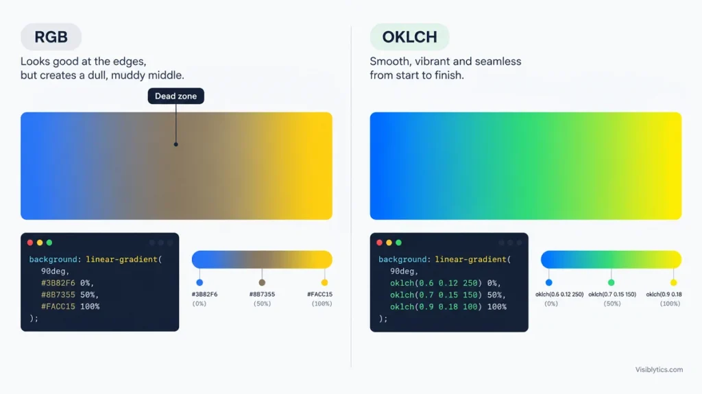
Your CSS gradient looks muddy because the browser blends your two colors by averaging their red, green and blue values, and for many color pairs that average is a dull gray or brown. The start and end look fine, which is why the middle feels wrong. In most cases the fix is one line of CSS and a smarter choice of endpoint colors.
I see this complaint constantly on hero sections, buttons and card backgrounds. The frustrating part is that nothing is broken. The gradient is doing exactly what the math says. Once you know where the mud comes from, you can usually fix it in a couple of minutes.
This guide walks through the five causes I check, in the order I check them. Each one has a short answer, an explanation, and a fix.
Why Does a CSS Gradient Look Muddy in the Middle?
A muddy gradient is a color blending problem, not a syntax problem. The browser has to invent every color between your two stops, and the way it does that decides whether the middle is vivid or gray.
By default, browsers treat HEX, rgb() and named colors as sRGB values and move each channel in a straight line from one stop to the other. If one color is high in red and the other is high in blue, the channels meet in the middle at similar values. Equal channels mean gray. That region has a name in design circles: the gray dead zone.
Take pure yellow, rgb(255, 255, 0), and pure blue, rgb(0, 0, 255). Halfway through, red is 128, green is 128 and blue is 128. That is mid-gray, and you asked two of the loudest colors on the screen to produce it.
Quick Diagnosis: Which of the 5 Causes Is Yours?
If your CSS gradient looks muddy, match the symptom below to the cause before changing anything. It saves a lot of random tweaking.
| What you see | Most likely cause | Jump to |
|---|---|---|
| Gray or brown band between two bright colors | Opposite hues | Cause 1 |
| Dull middle even with sensible colors | sRGB blending | Cause 2 |
| Dirty fade to white, black or transparent | Neutral or transparent endpoint | Cause 3 |
| One end drags the other down | Mismatched lightness or saturation | Cause 4 |
| Visible stripes or hard-to-read text | Banding or low contrast | Cause 5 |
Several can stack. A blue to yellow gradient with a transparent overlay and white text can fail in three ways at once.
1. Your Two Colors Sit on Opposite Sides of the Color Wheel
When two colors sit far apart on the color wheel, the straight path between them passes close to neutral gray. Blue to yellow, red to cyan, and magenta to green are the classic cases. Your CSS is fine. The pairing is the problem.
Here are the sRGB midpoints for some common pairs:
| Gradient | Midpoint in sRGB | What you see |
|---|---|---|
Blue #0000ff to yellow #ffff00 | rgb(128, 128, 128) | Flat gray |
Red #ff0000 to cyan #00ffff | rgb(128, 128, 128) | Flat gray |
Red #ff0000 to lime #00ff00 | rgb(128, 128, 0) | Olive brown |
Blue #0000ff to orange #ffa500 | rgb(128, 83, 128) | Dusty mauve |
Red #ff0000 to blue #0000ff | rgb(128, 0, 128) | Clean purple |
The last row is the useful one. Red to blue looks great because the middle is a real color that sits between the two. The channels never converge on one value.
The fastest fix is to add a bridge color. A bridge is a third stop that is saturated and sits between the endpoints on the wheel. For blue to yellow, a teal or green does the job:
background: linear-gradient(90deg, #2563eb 0%, #14b8a6 50%, #facc15 100%);
You are doing by hand what a smarter color space would do automatically. If you want to see what the middle of two colors looks like before you commit, drop both endpoints into a color mixer and look at the blended result. If the mix is gray, you know the gradient will be muddy.
2. The Browser Is Interpolating in sRGB (Switch to OKLCH or OKLab)
By default, the browser blends legacy color formats in sRGB, and that straight-line blending is what drains the saturation. Modern CSS lets you pick a different space with the in keyword. Changing it is often the smallest fix that makes the biggest visual difference.
/* Old behavior */
background: linear-gradient(to right, blue, yellow);

/* Blend through a perceptual color space */
background: linear-gradient(in oklch to right, blue, yellow);
In the second version, the gradient travels around the color wheel instead of through the middle of it. Blue to yellow becomes blue, then aqua, then green, then yellow. The saturation holds, so the mud disappears.
There are a few options, and they behave differently:
| Interpolation space | How the middle behaves | Watch out for |
|---|---|---|
srgb (default for HEX and rgb) | Averages channels, so gray dead zones | The source of the problem |
oklab | Direct, perceptual mix | Near-opposite hues can still pass through a soft neutral |
oklch | Travels around the hue wheel and keeps chroma | Introduces hues you did not choose, such as green |
hsl | Very vivid | Ignores how bright colors look to people, so it can feel too loud |
This is where people get surprised. OKLab improves most gradients, but for near-opposite hues like blue and yellow it can still pass through a pale neutral. OKLCH avoids that by going around the wheel. The cost is that your blue to yellow gradient now contains green. If that green is unwelcome, use in oklab, add a bridge stop, or pick endpoints that are closer together.
You can also control the direction of travel. The default takes the shorter route around the hue wheel. If you want a rainbow sweep instead, ask for the longer one:
background: linear-gradient(in oklch longer hue to right, blue, red);
Browser support for interpolation spaces is good but not universal. Josh Comeau cited roughly 91 percent support in late 2025. That is why I always keep a fallback, which I cover later in this guide.
3. You Are Fading to Transparent, White, Black or Gray
Fading to a neutral or transparent endpoint can create a gray or dirty band because those endpoints carry no real color information. The browser has to guess what hue the neutral stop should have, and the guess is not always what you want.
The classic version is transparent. In CSS, that keyword historically means transparent black. If an engine blends a bright color toward transparent black without accounting for alpha properly, the middle turns into a semi-transparent gray. Modern browsers handle this much better by interpolating with premultiplied alpha, but I still avoid relying on the keyword when the result matters.
The safer pattern is to fade to a transparent version of the same color:
/* Risky */
background: linear-gradient(to right, transparent, #2563eb);

/* Safer */
background: linear-gradient(to right, rgb(37 99 235 / 0), #2563eb);
The same logic applies to white, black and gray. In polar color spaces like OKLCH, a true neutral has no meaningful hue. Different browsers have been reported to fill that gap differently, which means a blue to gray gradient can look teal in one browser and purple in another. The workaround is to give the neutral a matching hue:
background: linear-gradient(
  in oklch to right,
  oklch(60% 0.2 264),
  oklch(95% 0.001 264)
);
The tiny chroma value keeps the hue defined without visibly tinting the color. If you are stuck with a stubborn case, switching that one gradient back to in oklab or plain sRGB is a reasonable escape hatch.
Dark overlays on photos are the other place this bites. A pure black to transparent overlay on a colorful image often looks gray and heavy. Tint the shadow toward the image’s dominant hue instead, with something like oklch(25% 0.05 264 / 0.9), and the overlay feels like part of the picture.
4. The Endpoints Have Mismatched Lightness or Saturation
A gradient can also look muddy when one end is far duller or darker than the other, because the transition drags the vivid end toward the weak one. This happens even when the hues are close together.
Think of a bright, saturated purple fading into a near-black navy. The middle is neither. It is a dark, low-chroma purple that reads as dirt. Another version is two colors that share the same numeric lightness but look very different. Yellow feels much lighter than blue to the human eye, even when a basic color model scores them as equals.
Here is what I check:
- Hue distance. Staying within roughly 30 to 60 degrees on the wheel keeps blends clean. Beyond that, plan for a bridge stop or a polar interpolation space.
- Saturation gap. If one end is vivid and the other is almost neutral, expect the middle to lean dull.
- Lightness gap. Large jumps in lightness make the middle feel heavy. Add a mid stop with the same hue at an in-between lightness.
background: linear-gradient(
  in oklch 135deg,
  oklch(72% 0.19 300) 0%,
  oklch(58% 0.19 285) 50%,
  oklch(42% 0.17 270) 100%
);
Building endpoints that already relate to each other is easier than rescuing mismatched ones. A color palette generator is handy for this, because palettes from one base color tend to share saturation and lightness behavior. Pull two or three related shades from the palette and use those as your stops.
5. What Looks Muddy Is Actually Banding or Low Text Contrast
Sometimes the gradient is fine and what feels muddy is banding or unreadable text sitting on the middle of it. Both are easy to mistake for a color problem, and neither is fixed by changing the interpolation space.
Banding appears as faint stripes across a large, smooth area, especially with subtle color differences. It comes from limited color precision, so adding more color stops does not help. The common fix is a very faint noise or grain overlay that breaks up the steps, or making the gradient cover a smaller area with a larger color difference.
Contrast is the quieter issue. A gradient that runs from dark to light behind a headline can look great in a screenshot while part of the text fails to stay readable. WCAG asks for at least 4.5 to 1 for normal text and 3 to 1 for large text, and you have to meet that against the worst point of the gradient, not the average. Run your text color against both ends and the middle in a color contrast checker. If one spot fails, darken that end, lighten the text, or put a soft scrim behind the copy.
I treat this as a final pass every time. A gradient that looks clean but makes the heading hard to read still reads as a muddy mess to the person trying to use the page.
How to Test a Muddy Gradient Fix Step by Step
The quickest way to fix a muddy gradient is to isolate it, inspect the middle, and change one variable at a time. Guessing and changing three things at once makes it impossible to know what worked.
- Put the gradient on a plain
div. Remove overlays, images and text so you are judging the color alone. - Inspect the middle. Add a stop at 50% or sample the center with your browser’s color picker. If the value is near gray, you have found a dead zone.
- Try
in oklch, thenin oklab. Compare both. Keep the one that looks natural for your colors. - Add a bridge stop or adjust endpoints. Use this if the hues are too far apart or the lightness is mismatched.
- Check neutrals and transparency. Replace
transparentwith a same-color alpha version and give neutrals a matching hue. - Add the text and the overlay back. Then run the contrast check.
- Test in a second browser. Interpolation and neutral handling can differ.
Building and comparing versions is much faster with a CSS gradient generator than editing syntax by hand. Adjust the colors and angle, watch the live preview, and copy the CSS once the middle looks right.
CSS Gradient Fallbacks for Older Browsers
A fallback means older browsers still get a decent gradient even if they do not understand the interpolation syntax. The trick is to declare the plain version first and the improved version after it. A browser that does not recognize the second line ignores it and keeps the first.
.hero {
  /* Fallback */
  background: linear-gradient(to right, #2563eb, #14b8a6, #facc15);

  /* Improved version */
  background: linear-gradient(in oklch to right, #2563eb, #facc15);
}
Another route works everywhere. Calculate several in-between colors yourself in a better color space, then pass all of them as stops. Browsers still blend sRGB between each pair, but when neighboring colors are close, the difference is too small to see. It takes more code, but the result is consistent across engines.
Muddy CSS Gradient Questions Answered
Why does my gradient look gray in the middle?
The browser averages the color channels, and for hues far apart the average is a neutral. Use a bridge stop, pick closer hues, or interpolate with in oklch.
Why did my blue to yellow gradient turn green?
OKLCH travels around the hue wheel, and green sits between blue and yellow. If you do not want green, try in oklab or choose a different bridge color.
Do more color stops fix a muddy gradient?
A few well-chosen stops can, because they steer the blend around the dead zone. Piling on stops does not fix banding, which comes from limited color precision.
Is a muddy gradient a bug in my CSS?
No. It is a predictable result of how color blending works. The syntax is fine and the output matches the math.
Does in oklch work in every browser?
Support is strong but not complete, so always include a fallback line. Test in the browsers your audience actually uses.
Muddy Gradient Checklist Before You Ship
If your CSS gradient looks muddy, run through these checks in order:
- Are the two colors far apart on the color wheel? Add a bridge stop.
- Is the gradient blending in sRGB? Try
in oklchorin oklab, with a fallback. - Does it fade to
transparent, white, black or gray? Use a same-hue alpha color or a hue-matched neutral. - Do both ends have similar saturation and lightness? Add a mid stop or pick related shades.
- Is it banding on a large area? Add a faint grain overlay.
- Can people read the text at every point? Verify contrast on the lightest and darkest parts.
Most muddy gradients fail on the first or second check. Fix those two and the remaining problems are usually small. Once you have seen the gray dead zone a few times, you start spotting it before you even write the CSS.